Abstract
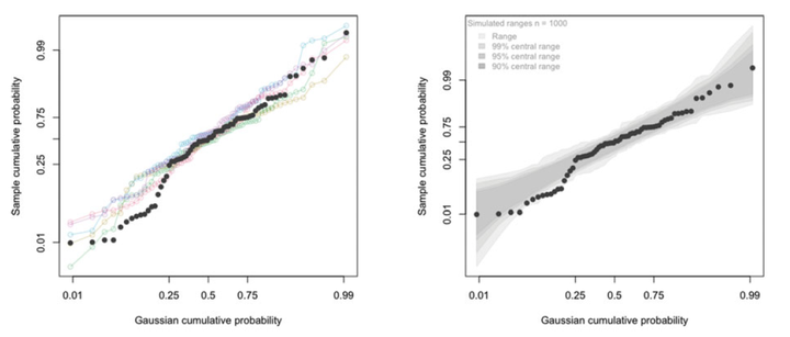
Quantile–quantile plots, or qqplots, are an important visual tool for many applications but their interpretation requires some care and often more experience. This apparent subjectivity is unnecessary. By drawing on the computational and display facilities now widely available, qqplots are easily enriched to help with their interpretation. An overview of quantile functions and quantile–quantile plots is presented against the backdrop of their early historical development. Strengths and shortcomings of the traditional display are described. A new enhanced qqplot, the self-calibrating qqplot, is introduced and demonstrated on a variety of examples—both synthetic and real. Real examples include normal qqplots, log-normal plots, half-normal plots for factorial experiments, qqplots for the average and standard deviation in process improvement applications, detection of multivariate outliers, and the comparison of empirical distributions. Self-calibration is had by visually incorporating sampling variation in the qqplot display in a variety of ways. The new qqplot is available through the function and R package qqtest.